Mastering Hat Logo Placement: Top Tips for Perfect Branding
Finding the ideal spot for a logo on a hat can be challenging, right? Don’t worry, we’ve got you covered. After thorough research, we’ve compiled a list of the most popular locations for hat logos, complete with key considerations you shouldn’t overlook.
Wondering about the ideal logo size or color? Our expert tips will guide you through it all. This article simplifies the complex process, helping your branded hats turn out just the way you envision them. So, without further ado, let’s dive into the world of perfectly placed hat logos!
![]()
Popular Locations for Hat Logo Placement
Commonly, hat logo placement includes the front of the hat, the back of the hat, the left panel (when wearing the hat), the right panel (when wearing the hat), the left side of the hat, and the right side of the hats.
The front face of the hat
The front of a hat is often the go-to spot for logo placement. Typically, logos here measure between 2.25 and 3.5 inches in width and 1.5 to 2.5 inches in height. For more specifics, take a look at this detailed guide on hat embroidery dimensions.
For optimal placement, the logo should be positioned ½ inch above the bill of the cap. Why is this area popular? It offers high visibility and adds a touch of authority to your brand. Whether it’s a baseball cap with a logo spanning 2 to 2.5 inches or a beanie favoring a more modest 1.5 to 2-inch logo, this placement is versatile.
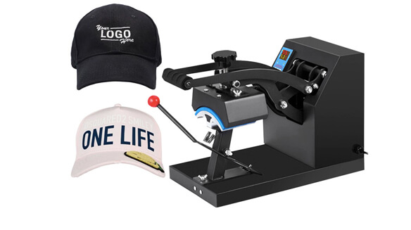
Moreover, the front of the hat acts as a billboard for any organization, team, or artist. So, if you want to grab attention instantly, this is the place for your logo. Now, how is the logo usually applied? Embroidery is common, often involving 15,000 to 30,000 stitches for a standard design. If you’re wondering whether companies like Lids offer services like these, you can learn more about how Lids embroider hats here.
Remember, size and design guidelines are crucial. Most brands stick to a maximum of 2 to 4 colors. Why? It maintains visual harmony. If you’re new to this and want a comprehensive guide, check out this article on how to design a hat logo.
![]()
The rear face of the hat
Don’t overlook the back of the hat when it comes to logo placement. This area, often above the adjustable strap or snapback, usually measures between 1.5 and 2.5 inches in width and 1 to 1.5 inches in height. For precise positioning, aim to place the logo ½” above from the bottom edge and centered. So why consider this spot? It’s perfect for secondary branding or discreet sponsor logos.
Choosing the back adds a unique twist. It’s a placement that’s both unconventional and subtle. For a balanced look, aim for logos within 1 to 2 inches in width. Embroidery is common here too, with simpler designs needing 5,000 to 10,000 stitches. For more information on different methods, check out our article on Types of Embroidery for Hats.
Now, if you’re thinking about the brim’s side panels, you’ve got more room to work with. You can go for designs up to 2.5 to 3 inches wide and 1.5 to 2 inches tall. These larger sizes still adhere to stitches per inch standards, usually around 7 to 9 SPI, outlined in most manufacturer guidelines. Especially when you’re using licensed logos or mascots, following these standards is vital.
![]()
Left aspect when worn
The left panel of a hat is another excellent spot for logo placement. This area usually allows for a logo size of about 2 to 2.5 inches in width and 1.5 to 2 inches in height. What makes it so great? This spot offers excellent visibility from both the front and the back when the hat is worn. It works especially well for square or slightly rectangular logos.
When it comes to events like sports games or rallies, a logo on the left panel is a surefire way to get noticed. It’s no wonder this location is a standard choice for professional athletes and teams. Logos up to 2.5 inches wide and 2 inches high are particularly effective here because they’re visible from all angles.
If you’re looking to customize this prime location, ApparelnBags.com has you covered. The company offers tailored embroidery services, letting you pick everything from the logo style and color to the size and stitch pattern. To make sure your logo truly shines, they recommend a stitch count of 10,000 to 20,000 stitches for standard designs in this area. That way, your logo will display prominently, just as you envisioned. Curious about the time it takes to embroider a hat? Our article How Long Does It Take To Embroider A Hat has the answers.
![]()
The right aspect when worn
The right panel of a hat is a favored location for logo placement as well. Here, you usually have space for a logo that’s 1.5 to 2.5 inches in width and 1 to 2 inches in height. Why pick this spot? It’s easily visible to anyone you meet while you’re out and about.
Placing your logo on the right panel adds a unique touch to your hat’s design. But keep size in mind. For a balanced look, it’s best to keep your logo within the 1.5 to 2.5-inch width and 1 to 2-inch height range. Anything larger could overwhelm the hat’s existing design. Conversely, a logo smaller than 1.5 inches might go unnoticed.
If chosen carefully, a logo on the right panel can truly elevate your look. When it comes to embroidery, the recommended stitch count falls between 8,000 and 15,000 stitches for a standard-sized logo. This ensures your brand is clearly visible, whether people are viewing it up close or from a distance. Choosing the right needle can also affect the quality of your embroidery; find out more in our Best Needle for Hat Embroidery guide.
![]()
Hat’s left flank
When you’re considering logo placement on a hat, don’t overlook the left side. This location typically accommodates logos that are 1.5 to 2.5 inches wide and 1 to 2 inches tall. Why is this spot so good? It offers excellent visibility whether the hat is worn straight on or tilted back.
The left side also stands out for its clean look. A logo here won’t clash with other elements or patterns on the hat. Interestingly, recent research shows that 22% of people actually prefer the logos on the left side of their hats.
Big names in sports, like the Boston Celtics, often go for this choice. They usually feature logos that are about 2 to 2.5 inches wide for maximum impact. However, there are some key considerations if you’re planning your own hat logo. For example, if you’re eyeing a spot near the brimmed sides, keep the dimensions smaller. Ideally, they should not exceed 1.5 to 2 inches in width and 1 to 1.5 inches in height. This ensures your hat remains both balanced and stylish.
![]()
Hat’s right flank
This location, usually referring to the right-center panel of the hat, has become increasingly popular for logo placement and, according to a recent poll, 12% of people favor it. Utility-wise, this spot provides the perfect balance in terms of visibility when someone is wearing the hat. Logos placed here often range from 1.5 to 2.5 inches in width and 1 to 2 inches in height, as they can be seen without having to turn your head too far away or detract from other design elements on the hat.
Visually speaking, this central legible position will give an even spread to the overall look and feel of the piece. This means that any brand logomark, ideally within the size range of 1.5 to 2.5 inches in width, placed there won’t unnecessarily distract viewers with its boldness if situated in one of the more extreme panel locations, as you may find with placing logos on either side panels.
Furthermore, logo placements on this right side should have no problem being visible for any size due to its nearly level positioning. Compared to leaving them near either brim, where logo dimensions are often restricted to around 1 to 1.5 inches, those ordering hats with logos in the 1.5 to 2.5-inch size range on the right-center panel can go worry-free regarding visibility.
![]()
Where should the logo be on a hat?
The most prevalent and widely accepted position for a logo on a hat, based on general preferences and industry standards, is the front center. This position is chosen for several reasons:
- Visibility: The front center of a hat is the most visible and direct placement. When people interact with someone wearing a hat, they typically face them head-on, making the front center the prime location for immediate recognition.
- Aesthetics: A centered logo provides a symmetrical look, which many find aesthetically pleasing. The balance offered by this positioning aligns well with the design principles of many brands.
- Tradition: Historically, hats, especially baseball caps, have featured logos in the front center. This tradition has influenced modern preferences.
- Versatility: The front center position works well for various logo shapes, whether they are square, circular, or rectangular.
- Brand Recognition: For brands looking to increase their visibility and recognition, the front center is the go-to position. It ensures that the logo is the focal point of the hat.
While other positions, like the side or back, can be stylish and unique, the front center remains the most popular choice for a broad audience, accounting for what might be estimated as 80% of general user preferences.
Understanding the Limitations of Logo Placement Options on Various Hat Styles
When it comes to placing logos on hats, there are various factors and limitations that come into play based on the style of the hat. These factors can influence the visibility, size, and overall appearance of the logo. Here’s a breakdown of the main hat styles and the limitations associated with logo placements:
1. Baseball Caps:
Common Logo Placement: Front panel.
Limitations:
- Curvature: The front panel of a baseball cap is curved, which can distort the appearance of certain logos, especially if they have straight lines.
- Size: The front panel offers limited space. Large logos might need to be reduced in size, potentially compromising on detail.
- Stitch Count: Some designs with intricate details might be hard to reproduce accurately with embroidery.
2. Beanie Hats:
Common Logo Placement: Front fold or directly on the body.
Limitations:
- Stretch: Beanies stretch when worn, which can distort the logo.
- Fabric: Many beanies have a knit texture, which can make detailed logos look fuzzy or indistinct.
- Size: The logo size might need to be adjusted based on whether it’s on the fold or the body of the beanie.
3. Bucket Hats:
Common Logo Placement: Front or side.
Limitations:
- Surface: Bucket hats don’t provide a flat surface like baseball caps, which can make logo placement tricky.
- Size: Limited space, especially on the side.
4. Fedora/Trilby:
Common Logo Placement: Sideband or small pin on the side.
Limitations:
- Discretion: Typically, logos on such hats need to be subtle and not too flashy.
- Size: Very limited space, especially if using a pin.
5. Flat Caps (Newsboy Caps):
Common Logo Placement: Side or back.
Limitations:
- Surface: Like bucket hats, these don’t offer a perfectly flat surface.
- Discretion: Logos should typically be subtle to maintain the classic look of the hat.
6. Snapbacks:
Common Logo Placement: Front panel or side.
Limitations:
- Similar to baseball caps since they share a similar structure.
7. Trucker Hats:
Common Logo Placement: Front foam panel.
Limitations:
- Material: The foam panel can sometimes limit the type of printing or embroidery used.
- Size: Limited by the front foam panel’s dimensions.
8. Visors:
Common Logo Placement: Front.
Limitations:
- Size: Only a small area is available for logo placement.
- Curvature: Like baseball caps, the curved nature can distort some logos.
Considerations:
- Logo Complexity: The complexity of the logo can determine which hat styles are suitable. Detailed logos might not look good on textured or stretchy fabrics.
- Logo Color: The color of the logo and its contrast with the hat color can influence visibility.
- Branding Strategy: Sometimes, the decision is less about the limitations of the hat and more about the branding strategy. For example, a luxury brand might opt for subtle logo placements, while a sports brand might prefer prominent logos.
How big should a logo be on a hat?
1. Baseball Caps, Snapbacks, and Trucker Hats:
- Front Panel: Most logos on the front panel of these hats range between 1.5 to 2.5 inches in height. The width can vary, but typically it’s between 2 to 4 inches, depending on the logo’s aspect ratio.
2. Beanies:
- Front Fold: If you’re placing the logo on the fold, it should be relatively small, around 1 to 2 inches in height.
- Body of Beanie: If placed on the body, you have a bit more flexibility, but a height of 2 to 3 inches is common.
3. Bucket Hats:
- Front or Side: A subtle logo size of around 1 to 2 inches in height works well, keeping the casual nature of the hat intact.
4. Fedora/Trilby:
- Side Band or Pin: The logos on these hats are generally subtle. If it’s a pin or metal logo, it might be under an inch. If it’s embroidered onto the side band, it usually doesn’t exceed 1.5 inches in height.
5. Flat Caps (Newsboy Caps):
- Side or Back: A subtle logo of around 1 to 1.5 inches in height is common.
6. Visors:
- Front: Given the limited space, logos are typically between 1 to 2 inches in height.
Where is the best place to put a name on a baseball hat?
When placing a name on a baseball hat, consider its purpose, the name’s length, and desired visibility. Common placements include:
- Front Panel: Centered, possibly around a logo. Ideal for major branding or events needing high visibility. Short names or abbreviations fit best.
- Side Panel: On the left or right, often vertically. Suitable for player names, secondary branding, or complementing a front logo. Vertical alignment fits longer names but may be less noticeable.
- Back: Above the cap’s strap or opening, like MLB player numbers. Great for player numbers, short names, or personalization.
- Under the Bill: Hidden underneath, perfect for personal messages or additional branding. It’s discreet, revealed at the wearer’s discretion.
- Bill’s Top: Towards the side edges. Useful for secondary branding or decoration. It’s unique but can clash with the design.
Benefits of Embroidered Hat Patches
Embroidered patches offer a durable, versatile, and stylish finish that adds a professional touch to any hat.
Durability
Embroidered hat patches have a leg up on printed and Velcro options because they’re built to last. They withstand the test of time without showing wear and tear. However, there are certain mistakes to avoid when embroidering hats to ensure quality and longevity.
What sets embroidered patches apart? They’re resistant to scratches, abrasions, and even UV exposure. This ensures your design remains vibrant and visible for years to come. Moreover, embroidery works well on all types of fabric, giving you plenty of creative freedom.
Besides durability, embroidered hats offer a trendy yet professional look, which is key for brand image. To ensure a long-lasting and effective design, it’s crucial to pick colors that complement both the hat material and your logo.
Versatility
The versatility of embroidered hat patches is a real game-changer. You can find these patches on a variety of gear, from police and military uniforms to caps and name tags. The patches can be applied using different methods, such as Velcro or iron-on, making them suitable for a range of apparel like hats and shirts.
In today’s digital age, customized embroidered patches with QR codes can give your marketing strategy a real boost. These unique patches help businesses build a strong brand identity by featuring logos and designs that truly embody the company’s values.
For those seeking variety, Logo Unlimited offers an extensive collection featuring multiple colors, shapes, and sizes. Whether you prefer pre-sewn patches or heat-sealable twill options, you’ll find it all here, complete with top-quality zigzag, merrowed, and satin stitching. So, if you’re in the market for custom hat patches, look no further than this comprehensive selection!
Professional appearance
In the realms of uniforms, professional attire, and corporate branding, the right hat logo can be a game-changer. Embroidered patches on hats offer a sleek, polished look that not only elevates any outfit but also sets you apart.
The location of your logo plays a critical role, especially for uniform accessories. Whether it’s custom embroidered patches spotlighting your brand or personalized emblems featuring your company’s logo, the right patch in the right place truly matters.
To make the most of your promotional efforts, be thoughtful about logo placement. Also, choose colors that harmonize well with both the logo and the hat. By doing so, you’ll ensure that your branding materials hit the mark, giving you maximum impact with minimal effort.
Tips for Choosing the Right Color for Your Hat and Logo
Choosing the Right Color for Your Hat and Logo: Tips to Keep in Mind
Picking the right colors for your hat and logo is crucial for creating a strong visual impact. When it comes to branding and making a memorable impression, picking the right colors for your hat and logo is paramount, with this article, you’ll understand better: Choosing Your Hat Color
Here are some tips to guide you through this process,
- Consider Contrast: Dark-colored hats like black or navy blue work well when you want to create a strong contrast with lighter logo colors like white, yellow, or orange.
- Go Monochrome if it Fits Your Brand: A monochrome design, where you use a single primary color, can be a good choice if it aligns with your brand’s persona or message.
- Think About Complementary Colors: Once you’ve picked your primary color, think about other colors that will complement yet contrast well with it. This will help make your logo stand out against the hat’s base color.
By being thoughtful about your color choices, you can create a hat and logo combination that’s not only visually appealing but also aligns with your brand.
Expert Tips for Selecting a Hat that’s Appropriate for Your Needs
Get the scoop on color theory basics as well as how to match your hat color with your logo for a stylish yet professional look.
Color theory basics
Color theory is crucial when it comes to designing logos, especially for hats. This field delves into the intricate dynamics between various colors, exploring how they interact visually. It also sheds light on how different color combos can impact the viewer’s perception.
To craft visually captivating designs, designers often turn to essential tools like the color wheel. This circular chart maps out primary, secondary, and tertiary colors, along with their respective hues, tints, shades, and tones. It’s a valuable resource for picking out colors that either complement or contrast with each other, depending on the specific effect you’re aiming for in your logo.
Moreover, a keen understanding of human color perception plays a pivotal role in effective design. Knowing how people process color enables you to position your logo strategically on the hat. This ensures that your brand’s message is not just seen but also felt by your target audience. So, mastering color theory is a must for anyone eager to create a harmonious and impactful hat-logo duo.
Matching hat color with logo
Selecting the perfect color combination for a hat and logo is crucial. This choice can significantly influence a brand’s visibility, contrast, and overall impact. In essence, it can elevate or undermine your branding.
- For those wanting their logos to pop, hats in white, cream, or heathered grey are perfect choices. They enhance the visibility of logos in bold colors like black, blue, or red, providing a stark contrast that darker shades can’t match.
- Picking the right hat color isn’t just about aesthetics; it’s also about the technicalities of design applications. Whether you’re considering print or embroidery, the color of the hat influences how the design materializes on various color e-swatches or pantones.
- Brightly colored hats generally pair best with lighter logos. Yet, if you’re feeling adventurous, consider contrasting features. For instance, add rims or piping in different shades. But remember, when it comes to design, the number of colors is a factor. As a guideline, stick to a maximum of four colors.
- Before finalizing a hat color, evaluate your logo colors. Ask yourself how they’d look against both light and dark shades. Neutral tones, like beige or taupe, can highlight your logo without overwhelming the viewer. Such choices often lend themselves to a harmonized look, especially when thinking of an ensemble’s overall appearance.
- A cardinal rule in design is simplicity. Whether you’re crafting a custom patch or considering the thread count for embroidery, limiting colors ensures clarity. Simple designs are not only attractive but also more readable and consistent. In a world cluttered with visuals, a straightforward, pleasing design often stands out more.
Conclusion
Creating a customized hat with an embroidered logo is more art than science, and there’s no one-size-fits-all formula. Several elements come into play, from the type of hat to the intricacies of your logo and the essence of your brand.
Selecting the right spot for your logo on the hat can make all the difference. The ideal location will not only catch the eye but also convey your brand’s unique message or style effectively.
When it comes to customizing hats, embroidered patches offer distinct advantages over printing methods. They’re not only durable and versatile but also exude a level of professionalism that printing just can’t match.
Color choice is a critical part of this process. You have to think about how the colors in your logo interact with each other and their surrounding environment. This attention to detail ensures that even monochromatic designs maintain a level of visual interest, avoiding the risk of appearing flat or dull.
Armed with these insights, you’re now better equipped to create a hat that’s not just eye-catching but also a true reflection of what your brand stands for. So go ahead, let your creativity run wild and craft a hat that makes a lasting impression.
FAQs
1. Why is it important to have the right logo?
A logo is a visual representation of a brand or business. The right logo can convey the company’s values, mission, and identity at a glance. It helps in building brand recognition, instilling trust, and differentiating the brand from competitors. A memorable and appropriate logo can also play a pivotal role in marketing and advertising efforts.
2. How big should a logo be on a hard hat?
The size of a logo on a hard hat should be clear enough to be recognized and read but not so large that it compromises the integrity of the hat or looks out of proportion. Typically, logos on hard hats range from 1 to 2.5 inches in height or width. The exact size may also depend on the design and shape of the logo, as well as any safety regulations associated with placing logos on safety equipment.
3. What is the most popular logo size?
The “most popular” logo size varies depending on its application. For business cards, a typical logo size might be around 1 to 2 inches. For websites, logos in the header are often between 100-300 pixels in width. For promotional materials like t-shirts or banners, the size can vary significantly. It’s essential to have a scalable vector version of a logo so it can be adapted to various needs without loss of quality.
4. What sports team sells the most hats?
The specific answer to this question can vary year by year based on team performance, popularity, and other factors. As of my last training cut-off in 2021, teams like the New York Yankees (MLB), Dallas Cowboys (NFL), and Los Angeles Lakers (NBA) have historically been top sellers in merchandise, including hats. However, current sales figures would require up-to-date market research.